The Challenge
Enhancing Engagement While Reducing Information Overload
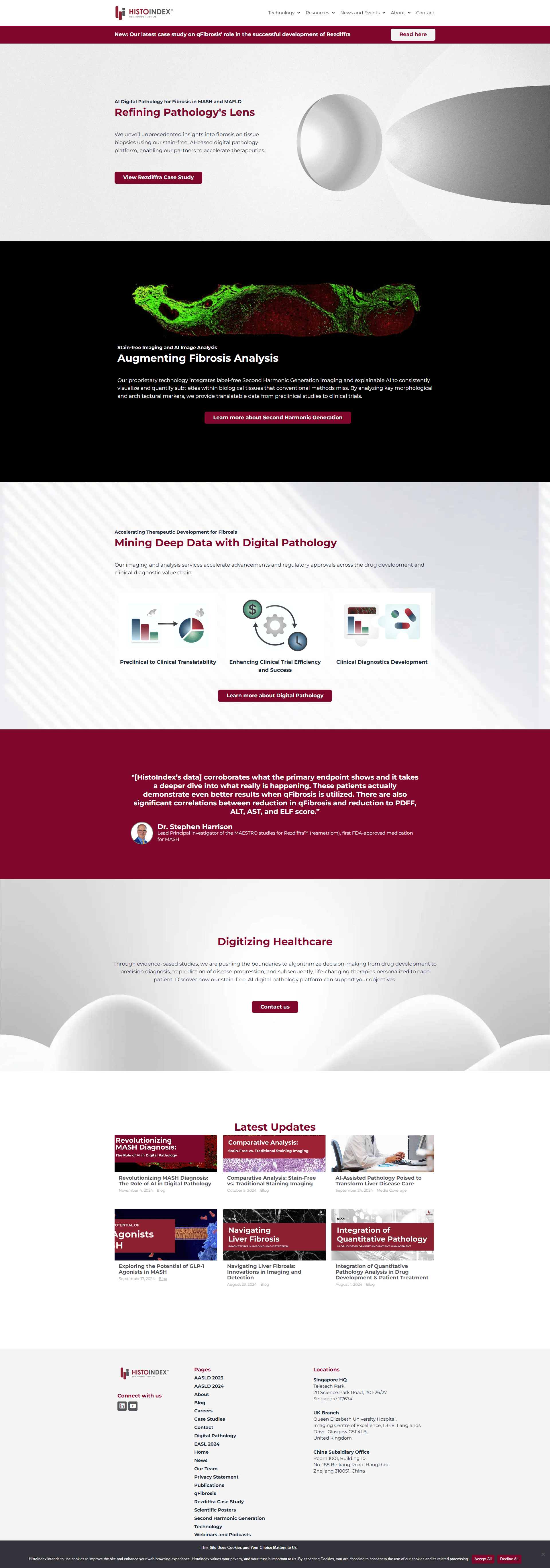
HistoIndex faced key challenges in revamping its digital presence:
- Balancing Information and Accessibility: Needed a design that reduced information overload, making complex content more digestible for diverse user groups.
- Guided Navigation: Aimed to create an information architecture that would guide users smoothly through the site, enhancing engagement and ease of access.
- User-Centric Visual Communication: Sought a mobile-first design that communicated effectively with the target audience, using visuals to improve clarity and connection.
These challenges were essential for creating a website that would improve user engagement while maintaining HistoIndex’s professional image.


